https://www.artofthetitle.com/title/catch-me-if-you-can/
|
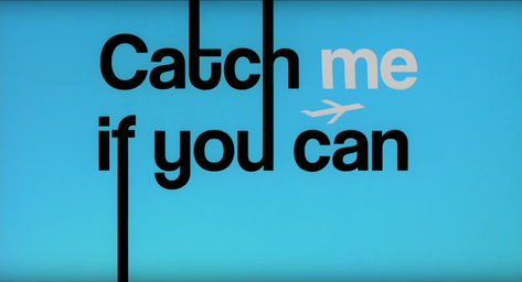
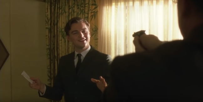
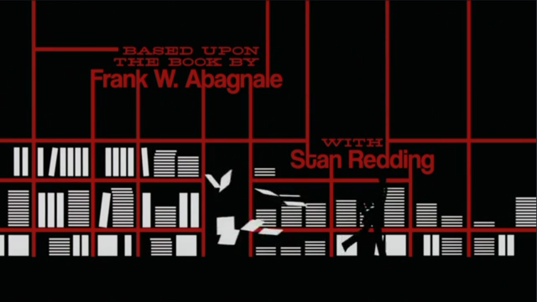
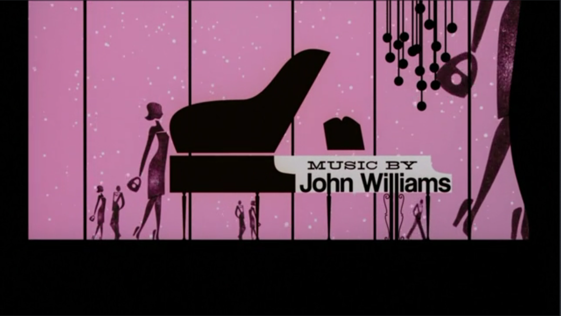
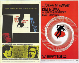
A whimsical jazz melody fills the air as a man scurries throughout the sequence, taking on different appearances as he is being stalked by a detective. The screen is filled with compelling typography and linear shapes extending throughout as the man tries to make his escape. In this title analysis we explore how the title sequence for Steven Spielberg’s Catch Me if You Can utilizes these details as a captivating homage to the legendary designer Saul Bass. The sequence begins with a silhouetted character moving throughout a blue background. As text for the credits shifts, airplanes begin to appear. The mysterious man watches intently at the pilots and stewardesses which emerge. He moves through a line on the screen, surfacing in a pilot uniform. As he does this, a huge silhouette of a detective is revealed as the space zooms out. The mysterious man is unknowingly watched by the detective as he moves throughout. As the main title appears the sequence transitions to a yellow resort background with a pool which the man swims through. As he reappears and passes by a large heel transforms into a doctor’s uniform. He meets a nurse and chats with her on an elevator until scurrying away as the detective gets closer. He switches to a business suit and is suddenly chased by the detective, moving throughout dynamic scenes of typewriters and archives of papers. He makes his final outfit transformation into a tuxedo as he attempts to escape from the pursuing detective. Him and the detective travel through a dark screen with lights sometimes appearing to shine on them, before entering into a scene of the night sky. As the detective finally begins to catch up with the man the screen fades to black and the film begins. The building blocks of Catch Me If You Can’s narrative are clearly laid out for unknowing viewers in the title sequence. This film is based on the true events of famous conman Frank Abagnale Jr.’s early life. After his father’s financial demise and parent’s divorce, Frank is compelled to run away from home. He quickly discovered that he his people skills gave him a natural ability to imitate personas of esteemed professional positions. He is successfully able to fool people into believing he is an airplane pilot, a doctor, and lawyer, while also gaining a knack at forging checks. This film is told through a series of flashbacks which envelop FBI detective Carl Hanratty’s pursuit to capture Frank. Designed by Oliver Kuntzel and Florence Deygas, hyperextended smooth lines drive the objects and typography of the title sequence. Lines move in and out of the screen, drawing audiences’ attention to the appearance and disappearance of the credits. In this same way the lines are used as entrances and exits for characters as they move throughout the screen. The characters also interact with the lines, hiding behind them, watching them, using them as a straw, a ladder, etc. These lines are always moving as if being chased in the same way Frank Abagnale is always on the run from Detective Hanratty. In order to “capture the spirit of Leonardo DiCaprio’s character” the designers chose to use an animation style which did not rely on the use of high-end technology. (artofthetitle) The characters were created in stamp form much like Abagnale’s use of stamps. The characters on screen are the designers original attempt, capturing the crudeness of his actions in the film. The playful score of this title sequence is a tune which captures the mischievous nature of Frank Abagnale Jr. and detective Hanratty’s sly pursuit after him. An original composition by John Williams, the instrumental gives off an old-fashioned jazz beat to the clever movement of text and objects on the screen. This score introduces a prominent leitmotif which appears several more times throughout crucial moments within the narrative of the film. Catch Me If You Can has a prominent focus on the sound track, utilizing this score (most noticeably Christmas music) to evoke certain emotions from the audience. It is in this same way that the nervousness that is stimulated by the title sequence is reformed to a quite different sentiment by the end of the film. The inspiration for the aesthetic for this sequence comes from the age in which its events take place. The goal of Kuntzel and Deygas’s was to give off a retro vibe and bring back audiences to the time frame of the film’s events (the 1960s). In doing this they found that there was no better way to do this than to implement a stylistic nod to Saul Bass’s minimalist design work. Looking at some of his posters for films such as Vertigo, The Man with the Golden Arm, and The Shining, there is a clear inspiration to the minimalist design of these pieces. This is especially evident in the character designs for the sequence. The title sequence for Catch Me If You Can utilizes fundamental minimalist designs which capture the audience through its musical tone and the short narrative depicted throughout it. The flashes of Saul Bass’s inspiration produce the 60’s vibe which encapsulates the film. Sometimes less is more and that is certainly the case with the notable design of this title sequence. Work Cited
https://www.artofthetitle.com/title/catch-me-if-you-can/ Comments are closed.
|
Archives
April 2024
|

 RSS Feed
