
By Joseph Naguski
Let the amazing type and colorful lights take over as you enter the void. As we began to explore in the WATCHMEN post, title sequences can be much more than just the names of cast and crew. The art of designing title sequences has long been in development since the beginning of films. From works like North by Northwest designed by Saul Bass and Se7en designed by Kyle Cooper titles have evolved dramatically. A very prominent part of these works and other notable sequences is the way they use typography combined with images to communicate the themes of the films in which they reside. The type of typography that is used in a film’s title sequence can evoke certain emotions from the audience as it prepares them for what is in store.
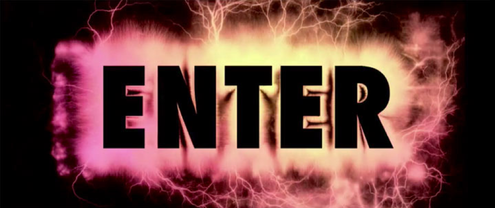
 North By Northwest (1959) | 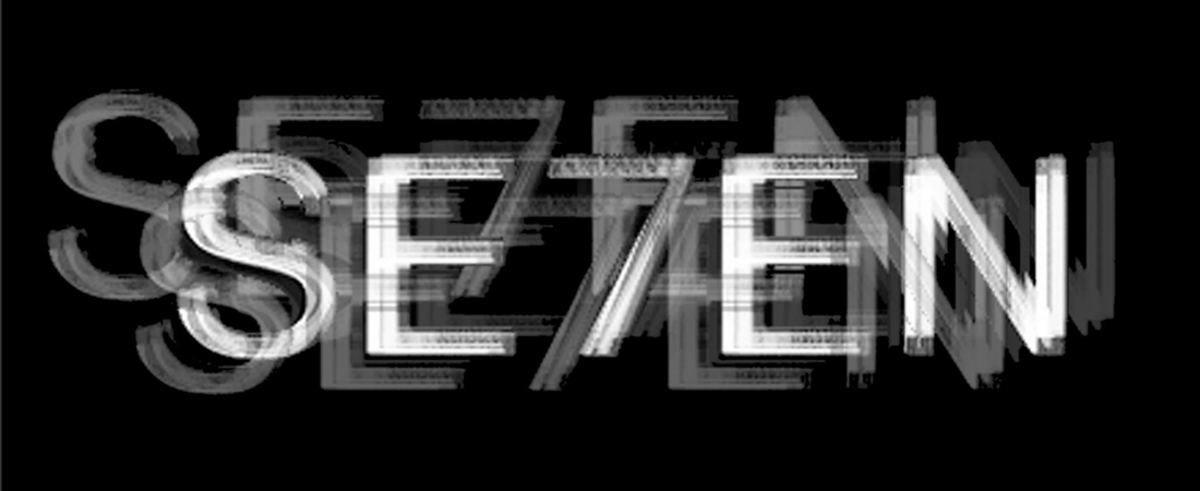 Seven (1995) |
The 2009 movie Enter the Void by Gaspar Noé starts off with a psychedelic barrage of typography in its opening title sequence. When the credits first hit you, they are not too outlandish. The words go by, flickering rapidly. Only one typeface is used with an orange and white color palette, until a sudden pause occurs. Then an abrupt onslaught of different designs starts to flash before the screen to the tone of a booming electronic beat. As the sequence goes on, the credits rapidly pick up speed with neon colors flashing before the viewer. This gives them a visual sensation of essentially what it feels like to be tripping on drugs. This might look familiar if you are a fan of Kayne West or his song “All of the Lights”. The music video for the song is heavily inspired by Enter the Void.
Seizure warning: This opening title sequence is not for those who are triggered by fast moving light and images.
The way this title sequence is portrayed certainly begins to prepare the audience for the psychedelic mess they are about to jump into. As the title sequence suggests, this movie revolves around drugs and the experience of using them. The plot centers on the life of an American drug dealer named Oscar living in Tokyo. The film explores the outer body experience he undergoes after his death. The composition Noé uses is cinematically captivating in the way it uses high crane shots to show this experience from a first-person narrative. Scenes filled with flashing lights and other trippy cinematic images are also scattered throughout the film. The content of the film is somewhat grotesque and heavily explores violence and sexual themes. It shows the troubling events of Oscar’s childhood, which led to him into the world of drugs. It also shows the relationships of those he was close to when he was alive. There is a special focus on his sister who became an exotic dancer, to his displeasure. The psychosis derived from these events could not have been displayed better than in the stunning visuals of the title sequence.
There are many layers to the design of this title sequence which make it so fascinating. Enter the Void is very unique because it focuses on using almost entirely type within its design to convey its theme. There are many films that mesh well with images and typography together but seldom do we see the sole use of typographic work alone. This work does not stick to one simple design either; there is a multitude of different styles that cohesively come together to express what tone Noé is trying to achieve. Interestingly, the logo was created using electrophotography by the German filmmaker Thorsten Fleisch. The use of different languages also uniquely adds to the motif of this piece. The combination of English, French, and Japanese collide in the same way as the different cultures do throughout the movie. The film itself is created by a French director and is designed by Tom Kan, who is Franco-Japanese. An interesting point about how the layout was made is that Noé “wanted a fast-paced compilation of typefaces, all very different, inspired by films, flyers, and neon signs to announce the tone of the film… wanted each title to reflect the person it concerned” (Kan). From this, I assume Noé truly appreciated his film crew and this is a nice way to honor them. Another interesting and integral part about the credits is that instead of just a select few of the credits placed in the beginning, Noé chose to have all of them at the start of the movie. The innovation that this sequence contains would not be possible without the choice to do this. More type allows for more possibilities to enhance the creation of the title sequence.
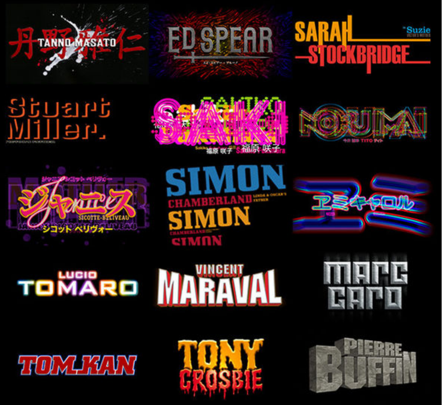
Some of the different credit designs used in the title sequence.
The original designs aren’t the only thing that make this so special. By themselves they have a presence but without sound to assist them they become less effective. Sound design is just as important as visuals in film, and title sequences are no exception. The electronic pop song “Freak” by LFO enhances the emotions being conveyed by the designs. As soon as it blasts, it assaults the audience with its energetic sound as the in-your-face type enters in and out of the title screen. The music definitely helps to portray the feeling of psychosis and causes a sense of anxiety in the audience. Moving the designs to the rhythm is no easy task and Kan does it beautifully.
Typography is something that not too many people outside of design think about. It is something that is seen all over in real life and it undeniably has a place in film. Type combined with cinematic images can create masterpieces of title work that can stand on their own, separate from the film they reside. In the case of Enter the Void, barely any images are even used. The variety of different designs and how they all cohesively come together is a sight to behold. This united with the fast flashing screen and stellar soundtrack creates something very remarkable and unique. I will come back to this title sequence many more times even though I will most likely never want to watch the actual movie again.
Works Cited
Noé, Gaspar, director. Enter the Void. Fidélité Films, 2009.
Kan, Tom, designer. Enter the Void. Fidélité Films, 2009.
http://www.artofthetitle.com/title/enter-the-void/
Noé, Gaspar, director. Enter the Void. Fidélité Films, 2009.
Kan, Tom, designer. Enter the Void. Fidélité Films, 2009.
http://www.artofthetitle.com/title/enter-the-void/
 RSS Feed
