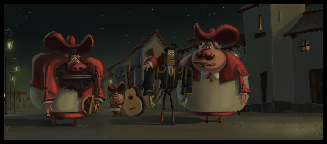
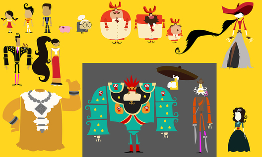
While making this recent animated feature, director Gutierrez expressed a lifelong love of cinematic art books. Such tomes contain the original conceptual designs for characters, costumes, and sets. In a medium as versatile as animation, it is especially easy for all of these to undergo especially extreme revisions during the film’s development. Gutierrez stated, “I saw every single one that comes out and my biggest heartbreak is I see all this glorious art, and then the movie doesn’t look like that! The mandate of this movie was our ‘Art of…’ book is going to look exactly like the movie.”
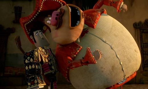
On paper, the character designs presented in The Book of Life are genuinely awe-inspiring. The color and detail represented is breath taking. Unfortunately, Gutierrez did not direct a “The Art Of …” book. This is where we run into a somewhat disconcerting visual paradigm. The character models for this movie are all over the place. The main characters are rendered with fairly realistic proportions. Their 3D models are akin to artists’ model mannequins and, as such, can perfectly convey human movement. However, beyond the few characters that drive the movie’s plot, the viewer will find that conventional aesthetics go right out the window. Secondary and background characters have grotesquely flattened features. It is not uncommon to see characters with five-foot proboscises jutting horizontally out of their faces with both nostrils flaring directly outward. It’s as if someone tried to make an animated feature based on Picasso’s cubist period. You might think this could lend itself to all sorts of wacky visual humor, however the exaggerated designs are never even addressed. No character ever has to limbo under someone’s ‘Tube Nose’. No, everyone just gives that character a conspicuously wide berth, which only serves to make such scenes appear conspicuously contrived.
I realize that thus far this article must sound like I’m really coming down on The Book of Life. I won’t lie; initially, I felt that The Book of Life was a visually-confused movie, completely uncertain of what it wanted to be. However upon further reflection, it occurred to me that there was a reason that the characters with tube-noses and balloonish torsos were unnamed: they were totally superfluous background characters. They didn’t have to share the visual aesthetic of the protagonists, because they would never be directly interacting with any of them.
This is where the bizarre genius of The Book of Life comes into play. Every character’s depth is presented both literally and figuratively as the narrative plays out. The fully developed characters are presented as fully-articulated, three-dimensional models, while the two-dimensional background characters remain just that. Such a bold art design choice cannot easily be dismissed as a cheap gimmick or happy accident. No, the art design presented in this film is an act of inarguable brilliance: using a character’s literal depth to masterfully color the audience’s perceptions.
http://www.hollywoodreporter.com/heat-vision/first-look-book-life-concept-683635


 RSS Feed
